Branding
Logo Appeal on Corporate Clothing
When we talk about logo appeal on corporate clothing, we are basically asking: "Does this logo look good on a shirt?" It sounds simple, but a lot goes into it.
Introduction
Have you ever walked into a store and seen the staff wearing matching shirts with a sharp, clean logo? Immediately, you probably felt like you were in good hands. That feeling isn’t an accident. It’s the power of logo appeal on corporate clothing. In today’s world, your brand isn’t just a website or a business card. It’s what your team wears when they meet clients, deliver packages, or stand behind a counter. If your clothing looks “blah,” your business might feel “blah” too. But when you get the logo right, you turn your team into a walking, talking success story. In this guide, we are going to break down everything you need to know about making your brand look amazing on fabric. No fancy marketing talk, just simple tips to help you win.
What Exactly is Logo Appeal on Corporate Clothing?
Corporate Clothing When we talk about logo appeal on corporate clothing, we are basically asking: “Does this logo look good on a shirt?” It sounds simple, but a lot goes into it. Think about a logo on a computer screen. It can have tiny lines, 20 different colors, and glowing effects. But when you try to sew that onto a polo shirt, it might look like a messy blob of thread. Appeal is all about:
If the answer to these is “Yes,” then you’ve got great logo appeal.
- Visibility: Can people see it from a distance?
- Professionalism: Does it make your team look like experts?
- Style: Would your employees actually want to wear this outside of work?
The Psychology: Why Your Logo Changes How People Feel
Believe it or not, the way your logo looks on a jacket or a cap actually changes how people think about your business. Science shows that our brains react to colors and shapes without us even knowing it.
1. The Power of Color
When choosing your corporate clothing, the color of your logo and the fabric must work together.
- Blue: This is the “trust” color. It’s why banks and tech companies love it. It feels calm and reliable.
- Red: This screams “energy” and “excitement.” Great for fast food or high-energy services.
- Green: Think “growth” and “health.” Perfect for landscaping or wellness brands.
- Black/Gold: This is the “luxury” combo. It says your brand is high-end and expensive.
2. Shapes Matter Too
Simple Tip: If your logo is very complex, try using a “simplified” version for your clothing. Sometimes, just the icon or just the name looks way better than trying to squeeze in the whole thing.
- Circles: A round logo feels friendly and inclusive. It’s like a big hug for your brand.
- Squares/Triangles: These feel strong and stable. They suggest that your company is built on a solid foundation.
Where Should the Logo Go? (The Placement Guide)
Where you put the logo is just as important as what the logo looks like. If it’s in the wrong spot, it looks weird. If it’s in the right spot, it looks like a high-end uniform. Export to Sheets
Embroidery vs. Printing: Which One is Better?
This is the big question. Do you want your logo sewn on (embroidery) or “inked” on (printing)? Both have their pros and cons when it comes to logo appeal on corporate clothing.
Embroidery (The Classy Choice)
Embroidery uses thread to stitch your logo directly into the fabric.
- Pros: It lasts forever. It doesn’t fade in the wash. It looks very “expensive” and professional.
- Cons: It’s not great for very thin fabrics (like cheap T-shirts) because it can make the fabric bunch up. It also can’t handle super tiny details.
Screen Printing (The Bold Choice)
This uses ink to “paint” the logo onto the clothes.
If you want your team to stand out, follow these three simple rules:
- Pros: You can do huge logos across the back. It’s cheaper for big orders. Colors stay very bright and “pop” against the fabric.
- Cons: Over time, the ink can crack or peel if you don’t take care of it.
1. Contrast is King
Don’t put a dark blue logo on a black shirt. Nobody will see it! You want your logo to stand out. If your shirt is dark, use a light-colored logo (like white or silver). If your shirt is light, use a bold, dark logo.
2. Size It Right
A common mistake is making the logo too big. A giant logo on the chest can look “cheap.” Usually, a logo on the left chest should be about 3 to 4 inches wide. That’s enough to be seen without being overwhelming.
3. Keep it Clean
In 2026, the trend is minimalism. You don’t need your phone number, your website, and your physical address all on your shirt. People will just search for your name on their phones. Keep the shirt focused on your logo and your name. It looks much cleaner!
How Branded Clothing Helps Your Team
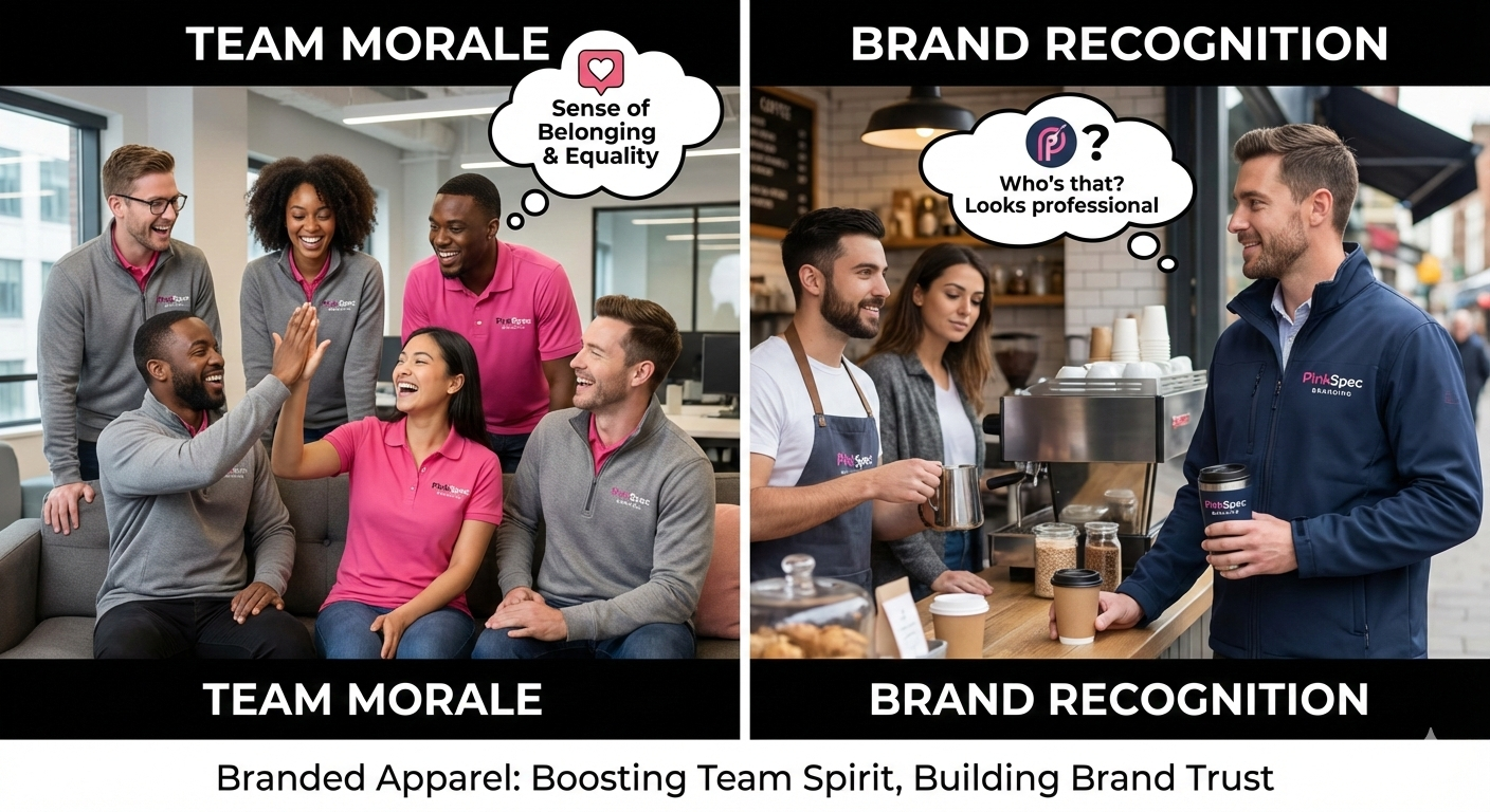
It’s not just about the customers. Having high logo appeal on corporate clothing actually makes your employees happier.
- Unity: When everyone wears the same logo, they feel like they are on the same team. It breaks down walls.
- Safety & Recognition: In a busy environment, customers need to know who to ask for help. A clear logo makes that easy.
- Pride: If the clothes look good and fit well, employees feel proud to wear them. They might even wear them to the grocery store after work, which is free advertising for you!
Common Mistakes to Avoid
Before you hit “order,” watch out for these “oops” moments: 1. Too many colors: More colors usually mean more money, and it can look messy. 2. Poor quality fabric: Even a great logo looks bad on a shirt that is see-through or itchy. 3. Ignoring the “Fit”: If the shirts are all “extra-large” and your team is small, the logo will be hidden in the folds. Get the right sizes!
Ready to Level Up Your Look?
Creating great logo appeal on corporate clothing doesn’t have to be a headache. It’s all about keeping things simple, choosing the right colors, and picking quality materials. When your team looks good, your business looks good. If you are looking for high-quality items that will make your brand shine, you should definitely look into purchasing from Pink Spec Branding. They know exactly how to take your logo and turn it into a masterpiece on any piece of clothing. Whether you need hundreds of shirts for an event or just a few sharp jackets for your sales team, they have you covered.
1. What is branding?
Branding refers to the process of creating a unique identity for a company, product, or service through distinct visual and emotional elements such as logos, messaging, and values. It helps differentiate a business from its competitors and fosters recognition and trust among consumers.
2. Why is logo appeal on corporate clothing so important?
It’s the first thing people see! A good-looking logo on a shirt builds instant trust and makes your company look established and professional. It’s like a visual handshake.
3. What is the best place to put a logo on a corporate shirt?
Businesses can implement personalization strategies by understanding their audience through market research, utilizing data analytics to gain insights, and creating tailored marketing campaigns that resonate with specific customer segments.
4. Should I choose embroidery or printing for my company logo?
If you want a high-end, long-lasting look for polos or jackets, go with embroidery. If you are making casual T-shirts or hoodies and want a big, colourful design, printing is usually better.
5. How do I make my logo stand out on dark-coloured clothing?
Use a “high contrast” color. If the shirt is black or navy, use a white, gold, or bright yellow logo. This ensures the logo is readable even from across a room. Click here